Categories
4th Year Graduating Projects Projects

Consumption vs Souvenirs

1st Project Proposal – Sustainability and Sportswear

Introduction

My original idea for my project was to create sportswear that embraced environmentally conscious design. I initially thought of placing emphasis was on materiality, wanting to study how materials such as bamboo or organic hemp act as adequate replacements for non-sustainable materials such as polyester.

Materiality

One of the projects I explored was Nike’s Space Hippie shoe which claimed to have the “lowest carbon footprint scores ever”. The shoe is made from recycled factory materials (fabric offcuts, t shirts and water bottles). The product exhibits sustainable values whilst being visually compelling as Nike have considered both the environmental impact user friendliness.
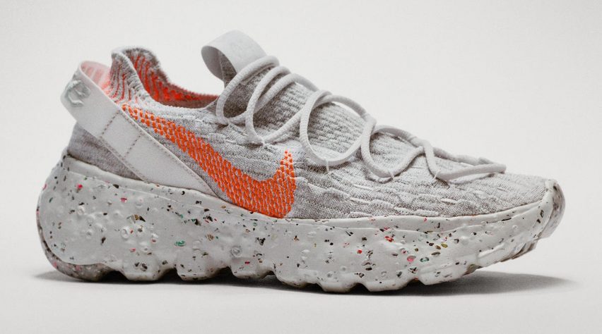
Nike releases Space Hippie footwear made from recycled factory waste
Nike’s Space Hippie Shoe

Abandoned Stadiums

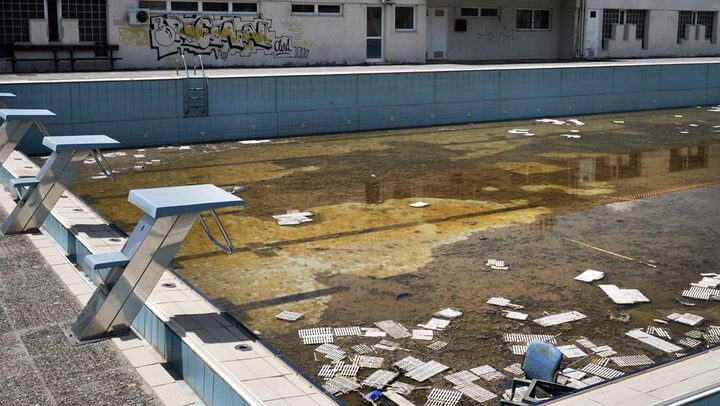
An idea I was considering at this point was ways of repurposing stadiums for social change. After reading an article describing the numerous abandoned olympic stadiums/venues which had been left disused following their Olympics games, I became excited by the concept of using the spaces for refugee centres or medical treatment for asylum seekers. I researched countries that had been financially affected by an influx of refugees, Greece was a frontline country of Europe’s migration crisis in 2015, when an estimated million refugees from Syria, Iraq and Afghanistan landed of the Greek coastline. I ultimately moved away from this course as I couldn’t envision creating prototypes based around this concept.
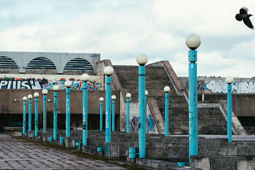
Soviet Venue – Moscow 1980

Olympic Aquatic Center – Athens 2004

Reusing Sports Equipment

Following my study into repurposing disused olympic stadiums, I explored how designers have repurposed other types of sporting products. Through desk research using sites such as Pinterest, DIYS.com and Instagram, I was able to observe range products that have been reworked to carry out a different function. From here, my project progressed to examining ways of adapting sportswear, not necessarily creating an entirely new function for an object.

Recycled Basketball Zip Bags

Uniforms – What they represent

The type of sporting products I began exploring was sportswear, in particular football shirts. Football shirts carry a lot of cultural meanings, they can represent a place, an era, a player but most importantly they convey a persons loyalty to a club. A shirts colour is the common feature which highlights allegiances, and this was an idea I wanted to experiment with. The first prototype I created was an idea for detachable sleeves.

Prototype 1
Prototype 1
Prototype 1

Using an old t shirt, a long sleeve shirt and a zip, I created prototype which had a removable sleeve, which could be exchanged with another person. What I was trying to learn was whether people would be willing to exchange ‘a part of their club’ to another person. I was also investigating whether people were willing to show another teams colour of their person. Using interview questions as a research probe I learnt that some users would be unwilling to take their sleeves with rivals, they felt it might dull down the rivalry having something so permanent on there arm.

2nd Revised Proposal – Interactions through Sport

Having completed the first gateway seminar, it was at this point that I revised my project proposal. I reconsidered my project, and came to realisation that I was more interested in the social side of sport, as I wanted to investigate the interactions fans have at sporting events. At the same time, I refined my project so I knew who I was designing for. I had narrowed down the type of fan I was interested in was a football one, however there were still traits I wanted to uncover about them. My response to this was to create character profiles which specified characteristics of potential users.

Character Profile
Character Profile 2

Creating these profiles made me realise the type of fan I was designing my project for was one that attends most games, is up to date with team updates, enjoys socializing with other fans, can afford to attend games/buy club merchandize, has experience with technology (tech savvy) and possibly supported club for significant period of time. Other traits I was considering was whether they had family, and do they attend the games with them, what is their age and their gender. On the subject of gender however, I interviewed both male and female participants, asking other they attend games; do they buy club merchandise; how much do they interact at football matches. I came to the conclusion that gender should not affect the design of my prototypes, since despite a higher proportion of football fans being male, there is no reason to exclude the other sex and instead I should design for all.

Character Profiles 3

With a clear idea of my target audience, I tuned my attention to my theorising my prototypes. Some of the themes I wanted to explore related to rivalries, solidarity, anti – conflict and mutual respect. Designing a product which either highlighted rivalries in sport, or combatted them interested me as I started to consider what a neutral fan is. When I was ideating connects I considered creating a attachable sportswear pieces which convey neutrality, this fan attends games to enjoy the experience of a football match, rather than the rivalries and dislike between teams.

I researched the different fan outbreaks of violence or protests that have occurred over the last 20 years to understand the ways rivalries can escalate. This research coupled with the interview probe I carried out earlier in the project made me realise I should careful as to what type of interaction I could expect between fans, if any. And so using this information, I turned my attention to creating a project to support solidarity between same sets of fans. Similar to the Black Lives Matter arm bands, I began thinking of adjustments I could make to sportswear to portray social messages.

Rivalries

Building off what what I had learnt from my first prototype, I created a second model which continued looking at interactions, this time however I wanted to experiment with the permeance of the prototype. I experimented with the idea of having a single use product, only one interaction can occur between fans. I did this by using cable ties, which would need cutting off to remove the sleeve once attached. When I tested the product on people, they were quick to first question how useful this permeant feature would be; they were unsure about the overall aesthetic and finally found the plastic cables uncomfortable. And so overall, I concluded this was a failed prototype, but in all honestly had preconceived suspicions when designing it.

Prototype 2
Prototype 2
Prototype 2

I should mention that a useful reference I used when creating these prototype was the football match that occurred in 1914 between British and German soldiers at trenches along the western front. Photographs, letters and interviews in the Imperial War Museums collection show a temporary truce occurred so opposing soldiers could exchange presents and partake in a football match.
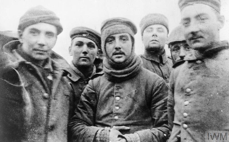
British and German soldiers fraternising at Ploegsteert, Belgium, on Christmas Day 1914, Front of 11th Brigade, 4th Division.

I referenced this since I was interested in incorporating the images into my design. Whether this was the image being printed onto sleeves, opposing fans having different images and so they must trade, this is an idea I was to revisit in future prototypes.

Solidarity

The third prototype I created was a continuation of the first two. I experimented with detachable feature of the design, opting to use fasteners as the attachment piece between body and sleeve. When I put the prototype to the test, I soon realised it was much more successful since users could easily detach and re-attach the sleeve by themselves. What I learnt from creating this prototype however is that despite the metal fasteners being easier to operate, people disliked the feel of them against their skin, and thought the gaps between each fastener was too great.

Prototype 3
Prototype 3
Prototype 3

I continued to develop this idea and created another souvenir which includes details that the previous prototypes were missing.

Prototype 4

Whilst a previous prototype I created used zips, it was not made from the synthetic material that running tops and football shirts are made from. This prototype includes that material. It was difficult sewing this material as it was very flexible and would not sit in one place when trying to attached the zips to the hems.

Prototype 4

Another feature of this prototype is the removable hem from one side of the shirt. This decision was based off the interview probe I carried out earlier in the course. The interviewee claimed that he wouldn’t want such a large part of another teams colour on his shirt. When I asked him if the tradable piece was reduced in size, would be more inclined to trade, his answer was yes. Moving forward from this design, I want to continue to experiment with different portions of a shirt, seeing what is the minimum size of sleeve a person would be willing to trade.

3rd Revised Proposal – Consumption and Souvenirs

At this point of my project I had revised my project proposal to focus more on the interactions between fans in a sporting environment. I became interested I the physical ways people show interactions, which led me to study the value of souvenirs. A souvenir can be defined as a physical/non-physical object that is kept as a reminder of a person, place, or event. I interpreted this definition as creating something that reminds a person of an experience or memory. I explored ways we make souvenirs, what are the typical souvenirs people keep and why people keep souvenirs. I did this by asking a set of people to show me the souvenirs they treasure most, and give me insight into when they purchased/found/made it and where they keep it. From here I started to create a diagram using InDesign to illustrate how people make souvenirs, and how ultimately how keeping them can reduce consumption of manufactured goods.

In preparation of gateway seminar 2, we were told to created 3 prototypes which pushed the boundaries of our project. I interpreted this as creating two ideas which are the extremes of one another, and creating one idea which is somewhere in the middle. The design method illustration beneath to illustrate my thought process. My project had progressed so that the main themes I was exploring related to consumption, sustainability and souvenirs.

Design Illustration Method

NFTs and Collectable Memories

The first idea I started exploring was based around the idea of creating a device which stores your memories from football matches, and has an interactive feature to it to allow for personalisation of the souvenir. Referenced below are images from my process stage, I created a number of smaller prototypes, some more sophisticated than others, which ultimately led me to my refined model.

Cartridge paper model
Fabric cuttings to speculative digital screens
First idea for wallet shape including fabric cuttings
Sketches of potential screen arrangements
Small, quick paper models
First experiments with magnets on clear base
Paper modelling with magnets
Back of ‘digital screens’
DiCartridge paper model
Diagram of magnets assembly
Sketches of potential design
Cutting through sketchbook
Further sketches of design
Notes of design

The process of sketching and model making led me to creating the prototype below.

Prototype 5

I created this prototype using an A6 notebook, a set of 3 mm magnets, newspaper cuttings, red cartridge paper and two fridge magnets. It is a speculative design as the 0.5x05cm newspaper cuttings are meant to resemble digital screens. On these screens, memories a user has uploaded will remain playing when the user opens the device up. When close the moving images will stop moving. The type of videos that would exist on the device are fan recorded videos of sports moments, these might included, highlights from games, clips of interactions with other fans, photographs of a stadiums atmosphere, food eaten at the game.

Prototype 5

The idea was inspired by NFTs and collecting tradable objects. I thought it couple interesting to create a device which has unique memories which could then be sold or traded with by other fans. This idea came from reading an article describing the difference between a consumer and a fan. Furthermore, I considered the idea of having the device as a ‘legitimacy’ object with proves who us a loyal fan and differentiates them from the casual fan. I began to expand on this idea by questioning whether the object could be only available to an exclusive range of people. Perhaps it is only available to those with season tickets, and they receive the object as a gift at the start of the year, to commemorate their support of the club. When I proposed this idea I the form of interview questions, I was surprised to see the positive reaction to the idea, with some interviewee’s stating they would like to see highlights from the previous season which have been selected by multiple fan entries.

Pre-determined Obsolescence

The final prototype I created for this stage of my project I entitled traces. The idea with these prototypes was to investigate the objects we leave behind when we play sport, and what are the accidental souvenirs we create and do they have value. I came to this idea when asking a friend about their beaten running shoes, they told me they kept them to remind themselves of the London marathon they had ran in previous years. It became a souvenir which reminded them of the training and hours they put in wearing the shoes. Despite the questionable appearance of the shoes they still kept them (not on display though).

This conversation led me onto investigating the breakdown of shoes during exercise. The first probe I carried out was placing shoes covers on my shoes and going for a 20 minute run. At 5 minute intervals I checked the condition of the covers and recorded them. The souvenir was leaving behind was a pair of torn blue shoe covers which I didn’t value enough to keep.

Torn shoe covers
Pressure tracing from 20 min run
Marking outlined with shoe boarder

I carried out another experiment when I replaced the laces of my football boots with elastic bands and cable ties. Once again I did physical activity in them and after the session observed the results. Unsurprisingly the bands and cable ties didn’t last and I was left with another broken object which I did not value enough to keep in as a reminder of that session.

Football boot with cable ties and cover
Cable ties are substitute for laces
Elastic band laces
Bands quickly broke when pressure put on them, change of direction caused breaks

Carrying out these research probes did lead me to developing another speculative probe relating to tying shoe laces. A metal wire surrounds a lace, and overtime the more the lace is tied, the more the wire comes off. Finally, after a significant length of time the wire piece comes off the user is left of a souvenir of that season of exercise. The difficulty I had with this probe keeping the wire on the lace long enough for it not come off after the first time of using it. A positive I took from making this probe however was that it did not affect my performance when I went for a run with the object on my shoe.

Cable ties linked to laces
Wrapping wire round laces, finding right rightness
Sketch
Prototype 6

Future: Continue to explore souvenirs in sport

Moving forward with my project I see myself continue to develop my ‘tradable sleeves’ idea as I still feel there is potential to create a more refined object. I would like to see how people would react to having multiple zips on their shirts, how comfortable do they feel, do they need more people to help them trade with others as well as a number of other features I would like to investigate.

Moreover I would like to revisit the 1914 football match reference and explore if there is an aesthetic feature I can take from the images and transfer it to my own work. This may lead my project back to solidarity and discovering the neutral fan, however it may be interesting to see how that theme relates to souvenirs and consumption.

I think it would be useful to explore sustainability more with my next prototype, and possibly explore creating a shirt with detachable pieces that are made from sustainable materials.

Finally, a topic I am also interested in exploring is citizen journalism, as I want to investigate how people would react to trading unique clips they have of sport events, as well how people record their clips.

Categories
4th Year Graduating Projects

Adjustability and Inclusion – Body Bias

‘Exploring inclusive methods regarding physiology to de gender bias in design’

My project is exploring inclusive methods to cancel out the physiological bias found within design, with a heavy lens on gender, since women have often been ‘invisible’ in the design process, from the data collection to product.

Gateway One

‘Exploring inclusivity through applying adjustable solutions to a product with body bias’

For this first gateway I focused on the physiological differences between men and women and how to apply an adjustable solution to a common ill-fitting product, in this instance, the glove. This product came up in discussion when considering products that don’t fit how they are intended on someone smaller than the ‘default man’ (Criado-Perez, 2019). Since the glove also fits into being a piece of PPE it seemed a relevant and necessary starting point.

Adjustable Method Applied – Self Blown Balloon Technique

First I autopsied a balloon in order to replicate the inflating mechanism, pictured to the right, with my replicas next to it.

Testing the self blown balloons mechanism paired with a medical glove in order to mimic self vacuum forming the glove to the hand, making it a customisable fit.

Featuring a ziplock around wrist to make ‘air tight’, balloon mechanism within each finger and a removable straw to be able to suction each finger

Results

During this exploration I realised the self blown balloon mechanism only works one way. In order for the mechanism to ‘seal’ it must be inflated, rather than suctioning the air out, and once air is blown in the seal does not allow it out, instead the balloon needs to be popped.

Semi blown balloon, cannot be deflated unless popped, can only be inflated.

Therefore I want to now explore successfully applying this technique, through applying an actual vacuum form device/plug to a product, and maybe exploring scale and different materials.

99p Futures

‘A future where everyday products are reactionary to the size of their user’

For this mini project I wanted to reverse the previous prototypes method of shrinking objects to size to instead have objects inflate to size within a futuristic narrative.

First exploration looked at inflating a pencil, came to realise, a pencil is potentially a bad example of object that would benefit from being re-scalable with a balloon application.

I then considered the phone, and how Caroline Criado-Perez discussed the iphone has reached its limit in size due to being too big for the average man.

As I have now considered ways of inflating and deflating, I have since thought about other adjustable synonyms and their antonyms. As well as other adjustable technologies:

Gateway Two

Since my project is aiming for inclusivity more than anything, the three aspects I am exploring within this gateway are all focused towards achieving inclusivity, and the different ways this could be done, through physiological means.

Achieving inclusivity through:

1. Adjustable Solutions

Considered an Edinburgh tenement bin kit intervention, turns out they are busted for everyone and although the bins are this large to fit more rubbish in, the opening could be more inclusive, like city bins with bin storage underground (image to the right).

2.Modified Instincts

In order to have inclusive spaces, for women and others in danger of violence against them in public, there needs to be modified instincts, an evolutionary trigger for physiological reactions to danger, fight or flight.

Things to test:

  • Do women have heightened instincts already?
  • headphones/musics effect on confidence and awareness
  • Can subfrequencys instil fear/unease?
  • How to create goosebumps and other physiological reactions to fear
  • Recreate feeling of point of no return, when you’re on the cusp of falling off chair

Further Exploration:

  • Animal defence mechanisms…
  • How to design for comfortability rather than discomfort.

3.Physiological simulation/mimicking

An empathy toolkit for finding bias that I haven’t considered as a near average woman

Reverse periscope to help uncover the overlooked differences (still to be pictured)

To Explore: other ways of making someone feel smaller, through illusions – Amnes room

Inclusivity is about: access, mobility and safety

As this project has progressed I have become increasingly aware of the benefits for designing for inclusion, where many others can benefit from the inclusive considerations in design. So although I am focussing on gender, hopefully my product will reach beyond this. Designing for ‘Edge Cases’, (Monteiro, 2019)

Citations

Criado-Perez, C. (2019) Invisible women : exposing data bias in a world designed for men / Caroline Criado Perez. London: Chatto & Windus.

Monteiro, M. (2019) Ruined by design : how designers destroyed the world, and what we can do to fix it / Mike Monteiro. SFCA: Mule Design.

Categories
4th Year Graduating Projects

Exploring Growth as Design

While most contemporary products may have the attributes of being economical, convenient and pleasing to the eye, they also tend to be monotonously mundane, inherently destructive of the environment, representative of grossly inequitable employment practices, culturally damaging in their blanket distribution and ethically questionable in terms of their marketing.

Stuart Walker (2006, p.10)

This project was initially triggered by the bleak realisation that anything I produce as a Designer will ultimately end up in a landfill, whether this be 1 year or 100 years after its design inception.

Leading me to greatly re-asses my practice and its implications. In the search for a more sustainable way of making I came across BioDesign: The collaboration between biology and design. This field has gained a renewed traction with recent bio-technological advances. The diverse material and functional opportunities that engaging with living materials has to offer represents a great attraction for designers.

Objective:
The main aim of this project will be to explore material growth and properties in order to produce unique designs engineered by nature, addressing the growing desire for bespoke products through an alternative way of manufacturing. Through co-designing with nature, I hope to produce unexpected outcomes both for me and for the user
following a more ‘life-sustaining’ approach to product creation.

MOVING AWAY FROM HEAT/BEAT/TREAT

After decades of faithful study, ecologists have begun to fathom hidden likenesses among many interwoven systems. …a canon of nature’s laws, strategies, and principles…

Nature runs on sunlight.

Nature uses only the energy it needs.

Nature fits form to function.

Nature recycles everything.

Nature rewards cooperation.

Nature banks on diversity.

Nature demands local expertise.

Nature curbs excesses from within.

Nature taps the power of limits.

Janine M. Benyus (1997, p.7)

I began by defining nature’s way of manufacturing by adhering to Janine M. Benyus’ criteria synthesis of nature’s manufacturing material process:

  • Life-friendly manufacturing processes
  • An ordered hierarchy of structures
  • Self-assembly
  • Templating on crystals with proteins

With these parameters of what it means to design like nature, I could begin to build a framework for my ‘Growth as Design’ practice. I wanted to explore changes in morphology obtained from non-heat/beat/treat approaches but first I decided to begin testing precisely with the heat/beat/treat to gain quick insight into fast changes in morphology. Heat/beat/treat approaches are those involving heating materials at extreme temperatures, beating them into shape, or treating them with harsh chemicals.

They served their purpose of playing with morphology in 3 key ways:

  • A material surface that morphs by the addition of another (they all changed shape once hot wax was added)
  • A form that changes in property by the addition of another material (a once flexible material, has now become of rigid and ‘brittle’ structure)
  • A material surfaces that affords new functions (before the wax was added, water could not be contained in the mesh structures)

With these findings in mind I began employing materials that would change in morphology through non-heat/beat/treat approaches such as rice paper.

By providing a base structure I could maintain the co-creating aspect of my practice, Designer would guide the structure and it would be completed by the change in morphology of the living material. I then applied this to yeast (living material) obtaining the following results.

Testing 1
Testing 2
Testing 3
Testing 4

From this experimentation I concluded that for an object to be deemed co-designed with nature, its purpose must be completed by the growth of the living material. This completion can be understood through one or more of the following criteria:

– aesthetics: the visual aspect of the object is it’s main purpose, and thus a morphing of this results in a completion of the product.

– properties: the addition of the living material affords new properties not previously existing in the product.

– function: the living material affords the physical function of the product.

which have been mapped from my initial quick-wax experiment observations.

EXPERIMENTING WITH MATERIAL CREATION

In order to gain deeper understanding of co-designing with materials, I needed to explore material development and testing, as the methodology would aid me in deciding whether I would want to pursue a bio-based material approach or continue to employ materials as co-designers.

3 Areas of focus.

Material Making

Pulp Foam: Combination of Waste paper, water and dishwashing liquid
Test 1: Dried Paper Pulp Foam
Different Materials: (Top Left: Dark street leaves, Waste Paper. Bottom Left: Brown street leaves, Cardboard)
Test 2: Tissue Foam
Test 3: Cardboard Foam
Test 4: Dark Street Leaves
Test 5: boiled Mandarin Peel
Test 6: dried Mandarin Peel Foam

Natural Foams: (possibility for packaging)

The way in which these materials dried led me to keep exploring a change in morphology through water evaporation, similar to how rice paper dried. This time I used Agar Agar (as a proxy for Microfibrillar Cellulose) as my main material.

3D printed (PLA) 0.3mm structures covered in Agar Agar solution

These explorations have re-defined some of my initial project aims, as they are not necessarily living materials but they do involve an alternative to heat/beat/treat manufacturing. (Criticism: Despite Agar being the main active ingredient, the structures are made from PLA, which has been heated to high temperatures, would need to find alternatives)

Material Agency

Through exploring design practices and working with yeast, some connections started to build. Until now I had seen Biodesign through the lens of a new edge-cutting design field mainly involving technology. However, the more I worked with how yeast grew and changed, the more I noticed it had a lot in common with craftsmanship and design fields such as ceramics, bakery and glass-making. All containing materials change in shape through manual ‘moulding’ during the design process, and which are sensitive to their environments (temperature, component proportions, humidity..).

Grid separating different experiment outcomes based on yeast (living material) vs sugar(food) concentrations
Test 1: Pushing form into shape
Test 2: using learned ratio knowledge (Green: highest rise, White: low) Fail
Test 3: Filling form (aimed to have a higher growth on left side, which did not occur) Plus form offered too little structure
Test 4: Living material output: air. Idea of using by-processes as part of the design?
Initial Framework for working with living organism
Revised framework

The interaction with these materials that change in morphology allow to place this design practice within Growing Design; which entails growing materials from living organisms to achieve unique material functions, expressions, and sustainable solutions for product design. 

Key framework:

From the experiments and prototypes I have begun establishing parameters for my work as well as definitions which will help guide the next steps.

From the first prototypes, I established that the fabrication of the product must move away from heat/beat/treat and I concluded that for an object to be deemed co-designed with nature, its purpose must be completed by the growth of the living material. This completion can be understood through one or more of the following criteria:

  • aesthetics: the visual aspect of the object is it’s main purpose, and thus a morphing of this results in a completion of the product.
  • properties: the addition of the living material affords new properties not previously existing in the product.
  • function: the living material affords the physical function of the product.

From the second prototypes, I was able to revise my definitions of living vs ‘dead’ materials and instead refer to them as Passive, Active and Semi-active materials:

Active: A living material that will continue to physically develop after the designer’s rigid input, resulting in a change of shape/colour/texture not stemming from water evaporation.

(e.g: yeast, mycellium, bacteria, fungi, algae…)

Passive: A non-living material that will adhere to the designer’s rigid input, without further post-designer development. Changes in texture, colour & shape occur directly from direct exposure to designer’s heat/beat/treat.

(e.g: wood, metals, plastics…)

Semi-active: A passive material in which changes in texture and shape may occur resulting from a ‘setting/settling’ of the material into place, but these will be due to water evaporation.

(e.g: pulp, agar, clay, plaster, cellulose…)

Additionally, I began to consider living material not only as visual co-designers but potentially benefitting from their products (e.g gas production, changes in colour/texture…)

In this manner I will take forward these parameters and apply them to the manufacturing and designing of the product to-be. The revised aim for my project will move away from current heat/beat/treat manufacturing methods, looking to design using less energy-consuming processes.

Revised project aim:

A co-design exploration of Active & Semi-active materials in product development as a response to unsustainable manufacturing methods, in search for unique and ‘life-sustaining’ design outcomes.

Categories
4th Year Graduating Projects

Gender and Design

”The exploration of gender in all capacities through products to express gender identity and implement the non-binary in design”

Gateway One

Prototype 1

Aim of this prototype was to test a hypothesis inspired by Judith Butler’s gender performativity theory in which she states that the repetitive performance acts forms what it means to be male/female. performance includes behaviours, decisions and desires which are associated with masculinity and femininity.

I was testing to see if a feminine/masculine repetitive ritual influences a persons gender identity. I focused on the feminine ritual performance of wearing a bra and was wondering if performing this repetitive feminine ritual for 3 days on a male test subject would influence his gender feelings for 3 days after the test.

A key aspect of a bra is to cover the nipple and I wanted to test this repetitive ritual to see if the wearer would feel more feminine. The prototype was made from adhesive tape so it would fit any size chest. The cover has a genderless form not resembling a traditional bra so the wearer would respond to the feelings of completing the ritualistic act not from the shape of the cover.

In order to test this prototype the subject wore the cover for 3 days and made notes on their gender feelings. I provided probe booklets which had prompts to help the wearer think about their gender feelings towards the ritualistic act they are taking part in. After the 3 days of wearing the cover they made notes about their gender feelings after the test too but didn’t wear the cover during this.

Observations from Prototype 1

•Connall became progressively more comfortable with wearing the cover over the three days. Uncomfortable in how he was perceived

•His behaviours were altered as he tried to make himself feel less uncomfortable.

•He noticed his chest area more while wearing the cover and this continued when not wearing the cover.

•“it does make me feel more effeminate”.

•Gender feelings were influenced but not for a prolonged amount of time and didn’t affect him while not wearing the chest cover.

•Test could have been made fairer by testing on more people and testing for a longer amount of time.

Prototype 2

After conducting the test for prototype one which aim was to test the ritualistic act of covering the nipple it can’t be ignored that form and the shape of the cover could also influence the wearers gender feelings too. 

I am testing if the form of prototype influences gender feelings when enacting a ritual and also testing if the form is more influential on gender feelings than acting out a ritual. My hypothesis is that a more traditional bra form will make the subject have more effeminate gender feelings due to the societal connotations around it compared to the prototype which was more non-traditional in its form.

I tested this prototype by conducting an interview to find out the feelings of the subject while wearing it. This was done in the form of a video interview (screen shots taken from the video). I asked questions about their gender feelings and their feelings in comparison to prototype one.

Observations from Prototype 2

•The form of a product used is possibly more influential on gender feelings than the actual ritualistic act it is used to conduct – gender also influenced through the interaction with a product. The interactions that can take place are influenced by the form of that object.

•Second prototype used for shorter time but more influential on gender feelings than prototype one. 

•I learnt that the length of time is insignificant when it comes to influence. 

What I learnt from Gateway one and how I used it in application to Gateway two

As I concluded that form and perception of that form is crucial in influencing gender feelings of the user, form is a key area that I am bringing forward to explore. Interaction with form is another area I will bring forward into gateway 2 as I discovered in prototype 2 interactions with a product influence gender feelings e.g. when the wearer lifted and readjusted that strap of the chest cover they felt more effeminate. Perception is another area that popped up more than once. Self-perception of the wearer of the cover and perception by other people looking at the wearer of the prototype.

Gateway Two

In my pervious project proposal I stated that I was mostly exploring the non-binary and this is the approach I took in Gateway one e.g. non-traditional genderless form for the chest cover. But through further research and observations of our society the concepts of sex and gender are intertwined, and heterosexuality as well as the binary is reinforced through social institutions to create social order and hierarchy. My point being is that as the binary is so ingrained in our society on all levels, I can’t simply ignore it!

My hopes is that through the exploration of the binary in various ways (perception, form and interaction) to create prototypes I can understand how gender exists in products and how this influences gender identity.

Perception Prototype

Gender identity is influenced by self-perception and perceptions others have. It is defined as a way of understanding and interpreting. Social perception uses the person, the behaviour of that person and the location to build up understanding. I used these three areas to test perception of self and outsiders perceptions.

Bra Prototype to test perception

Building on the prototypes I made in gateway one I altered and changed the form, meaning and purpose of the prototype. It is still linked to the nipple/chest cover by exploring a traditional feminine item and ritualistic act of wearing something across the chest, but this prototype doesn’t explore the act of covering the nipple. I removed the cups as I didn’t want the perception to be based off the idea of having breast as the shape of the cups would imply this but  I wanted the perception to be based off wearing a bra shaped form.

I moved away from tape as a material as I wanted the prototype to be more refined but also needed it to be worn by multiple people for testing. The prototype is to be worn over clothes in different social settings to test on different people to see how it alters behaviour, self-perception and outsider’s perception of the wearer of the prototype. 

Aims and Hypothesis of Social perception test

My aim is to test the perceptions of the wearer and observe outsiders perceptions of the wearer. Looking at social perception as a concept my aim is to see the influence that the person, location and behaviour has on the perception of the wearer. The final aim is to see if the perception of the wearer is altered depending on their gender.

My hypothesis is that when someone with a feminine gender identity wears the bra prototype, they won’t have major alterations to the perception of themselves and their behaviours won’t alter massively. Whereas someone who is masculine gender identifying, when wearing the bra prototype will be perceived by outsiders and themselves as being more effeminate. Their behaviours will alter for example embarrassment and hiding the cover or to compensate for the bra they change their body language to appear even more masculine.

Method

•Get a person to wear the prototype in a public location

•Make notes on the wearers behaviours while wearing the prototype- does their behaviour and body language change?

•Ask the wearer about the perception of themselves- what do they notice while wearing the prototype?

•Observe outsiders reactions to the wearer in the prototype- visual observation

Observations from the tests

Upon conducting these 2 tests I observed that Location didn’t influence perception of the user greatly as they both broke social norms by bringing the bra into a public setting and I feel the Perception of the user would be the same in most public settings. Due to this breaking of a social norm both genders were viewed as odd as the received strange looks and double takes. I did notice that the behaviour of verity showed that she was more comfortable while wearing the prototype than Cameron. This could have been due to the fact that she wears a bra normally and a bra is associated with her gender identity. Both of the wearer’s behaviours were altered as they became nervous and conscious of others perceiving them, I assume this is because it is not the social norm for either gender to wear a bra on the outside of their clothes.

In this test the perception of outsider’s views were only observational as I made notes of people looking/staring at the wearers. No verbal opinions of outsider’s perceptions were taken which is something that is explored in the next test of the prototype as I felt it wasn’t enough just to note down if the wearer was looked at strangely. 

Outsider Perception test- Aim and Hypothesis

This test of the bra prototype is solely looking at the perception of outsiders. 

My aims are to gain insight into outsiders’ perception and to see if gender is an influencing factor in this.

My hypothesis is that outsiders will view both genders as odd as they are breaking a social norm but for different reasons depending on if they are masculine or feminine. 

Method

To test my hypothesis, I being the person of feminine gender identity sat outside the ECA café waiting for strangers to ask me questions about the prototype I was wearing to gain insight into the perception of outsiders. A person of a masculine gender identity did the same thing but in Bristo square. 

During this process I made notes on the questions people asked us and the discussions we had. 

Questions/statements made by outsiders to the feminine wearer

•What are you wearing?

•Is that a bra?

•Why are you wearing that?

•Is it a fashion statement?

•Did you make it?

•Is it an accessory?

•Why is your bra on top of your shirt?

•Surely that bra has no function?

•Your bra should be under your shirt, love! 

Questions/statements made by outsiders to the masculine wearer

What are you wearing?

Why are you wearing that?

Mention of politics in discussion with wearer- political statement?

Are you gay?

Why are you wearing it over your shirt? 

What do you study? Intrigued if they were in the art school?

Do you want boobs?

Are you drunk?

Do you want to be a woman? 

Is there a purpose to you wearing this?

Observations from Outsider Perception test

I observed that Location influences who inhabits the space and therefore how the wearer is perceived. The location of the public settings in itself doesn’t influence the perception of the wearer but it’s the people who inhabit these different spaces and the questions they asked that influence the perception they have of the wearer. Different people inhabit different locations on campus for example more students at the ECA and more people of the general public at Bristo square.

For the feminine gendered person (me) the prototype was seen as an “accessory” and “fashion” compared to the masculine gendered person where the prototype was seen as a “political statement”. This is due to the fact that the bra as a clothing item is linked to the feminine gender

Outsiders pointed out to me when I wore the prototype that the “bra is on top of your shirt” and they went on to say that a bra is intimate and private and shouldn’t be on show, where as for the masculine wearer there was no follow up to that statement.

When worn by the masculine person it was seen more as an expression of their gender identity and sexuality with questions being asked such as “do you want to be a woman?” and “are you gay?”. The questions were sometimes put insensitively but they implied more that the bra was a form of expression in comparison to the feminine wearer who was viewed as making a mistake or a fashion statement. 

But overall, both genders were viewed as odd as they both broke social norms by bringing a bra into the public space. For the feminine gendered person it was the act of wearing a private and intimate bra on show to the public and for the masculine gendered person it was the act of wearing and potentially identifying with an effeminate item of clothing.

Both show the subordination of femininity in our society as it is looked down upon to identify with being overtly feminine. 

What could be improved

Because I and the masculine participant attend the university we would run into people we knew while wearing the prototype and they would ask questions more freely which isn’t accurate and does produce bias.

Next time I would not choose places on campus around the uni n hopes that this would mean I would see less people I know.

On the other hand as they knew me and the other participant they would ask questions more freely and it is still someone’s perception whether they know us or not.

Conclusion

Moving forward I am interested in the idea of a collective experience for both feminine and masculine genders this collective experience can explore the idea that femininity and masculinity can exist in one person as a way to introduce non-binary into the design of products.

Form Prototype

As discovered in Gateway one, form influences gender feelings of a person using that product somewhat more than the actual act of doing.

I wanted explore gender through form by creating prototypes which are sculptural to prompt an emotional response in the user.

The aim is to better understand how gender physically presents itself in products.

The aim is to create forms with the idea of the “origin” of femininity and masculinity in mind.

Exploring this idea of “origin” forms.

Method

Using language and words which are used to describe feminine and masculine aesthetics I created two lists splitting them up. The words that make up the lists come from descriptions of gendered products e.g. razors for men and women.

I took words from the list of feminine descriptors and made a prototype using them as a prompt then I did the same from the list of masculine descriptors.

I then chose random words from both lists to create prototypes more ambiguous in its form resembling masculinity and femininity.

From the previous bra prototype I made and tested I now want to explore femininity and masculinity existing cohesively. Through these set of prototypes I explore the binary but I also explore how femininity and masculinity can exist together in one form.

What I learnt

I felt like the forms that embody masculinity and femininity together were more complex and interesting than the forms that only resemble masculinity or femininity on their own. This links to the conclusion that I drew from the perception prototype that masculinity and femininity can coexist together in one person but in this case I explored this through form. I learnt that 3D printing is an effective way of producing accurate and complex forms that I could necessarily do by hand. Only down side of 3D printing is that it only prints in one material and only a couple colours so materiality and colour couldn’t be explored effectively in these prototypes.

What could be improved

I could have done more but due to time pressure 5 was all I could produce. By producing more I could explore other trigger words and different combinations of them to produce forms that resemble both masculinity and femininity.

Some words on my lists were linked to texture, materials and colour. These prototypes only explore form and shape, nothing else. So to improve on these prototypes I need to explore how materials and colour influence the perceived gender of an object. I would like to explore this in my next iterations. 3D printing allows complex shapes to be produced which is useful in exploring form but maybe next I could look at applying different materials to the 3D printed forms I made to explore materiality more deeply.

Interaction Prototype

Interaction with a product and its form influences gender feelings which I discovered in a gateway one through my test subject interacting with a chest cover with a traditional bra form and feeling more effeminate while wearing and interacting with it than a chest cover with a non-traditional shape.

My aim is to observe and ask questions regarding peoples interactions with the gender ‘origin’ prototypes I made previously.

I want to see what objects they are drawn to and why.

I want to see which form they identify with the most.

I want to ask what words they would use to describe each prototype and to see if gender is used in their description.

My hypothesis is that people will choose to interact with the prototypes that lean towards their gender identity e.g. feminine people will interact with feminine objects.

I don’t think gendered words will be used often to describe the forms and if they are used they will be one of the last words on the list and they couldn’t think of other words to describe that from. Gender weighted words will be used to describe the objects earlier on e.g. cute, soft, hard.

Method

I have not completed this yet but this will be the method I plan on using.

Sit various people ( I am thinking four people, two men and two women) in front of the prototypes. Do nothing for the first minute and don’t prompt them to do anything as I want to see how they would naturally interact with the forms.

After that ask the a series of questions:

Why did you interact with that form?

What words would you use to describe this form? get them to write as many down as possible

Which form do you identify with and why?

Ask them to gender each object masculine, feminine, non-binary. Do this later as I don’t want the person knowing the test is centred round gender. I want the answers to be as authentic as possible.

I will ask questions that come to mind too as each person will interact with each object differently and to understand their actions more deeply I will need to ask more specifically catered questions to them.

I will record the sessions I have so I don’t miss anything that is said and so I can go back and dissect what people said further.

Conclusion

Test to be completed…

Categories
4th Year Graduating Projects

Design for Longevity

The purpose of my project is to investigate ways to change consumer behaviours and habits to make consumption more mindful.
My project is divided into three layers, 1) Mindless consumption; 2) Saturated market; 3) Sustainability; all of which have the objective to not deplete our planet from its resources.
Overall, the goal is to design for longevity.

———

Gateway 1:

In the first round of making prototypes, my ideas were fixated on the notion of what is ‘essential’. This initial experiment involved making chair prototypes, exploring their essential or inessential characteristics, ultimately aiming to find their truest form.

Upon executing this exercise, I realised that there is no ‘one’ framework to define what is essential, it will be different for everyone.

Also, due to the fact that there are already so many chairs in the market, these new chairs do not make a distinction with what already exists and does not portray the ‘essential’ in any way. 

In re-thinking this idea about what is ‘essential’, I looked deeper into how and why we consume, learning about our emotional attachment to objects and how that affects our habits as consumers. There is a constant state of desire that will most likely never be satisfied, as one always strives for more. These cyclical loops of desire and yearning for excess often draw the consumer towards objects that have a short life span to satisfy the temptation and brief moments of pleasure.

Gateway 2:

This led me to disentangle words that are affiliated with consumption: desire, renewal, self-identity, newness, excess, status, display, unnecessary, temptation…

Playing with this notion of desire, I began to explore objects of sentimental value that may over time become essential to us. We do not want to discard them, rather it’s these objects that we want to keep for the rest of our lives. Objects that are symbolic of specific moments in our lives, storing mementoes and memorabilia.

I must make a disclaimer that there is irony in this exploration. It is almost promoting consumption and accumulation of things. But I aim to make something that enhances our sentimental value towards those objects that are meaningful to us.

To reach this aim, I interviewed various people, asking them to share with me their collection of sentimental objects. The group of people interviewed varied in age group to have a broad depiction of what could be ‘essential’ to each individual. They described each of the objects’ backstory and why they are emotionally attached to them. With this, I collected a database of what this sentimentality looks like. 

Example of a participant’s collection of sentimental objects
Collections of sentimental objects of different participants.

The following are some of the conclusions I made from these interviews:

– Most objects are not purchased by themselves but rather are gifts from other people; they behave as physical and symbolic representations of these particular people
– Some of the objects are stored away or even hidden in boxes or drawers, rarely used daily
– One of the participants is emotionally attached to the objects she uses for work, meaning she interacts with them daily
– Photos and jewellery are particularly meaningful and the most common objects of sentimental value

I realized that you cannot design something that can become sentimental over time, but rather you can design to heighten its value. Using this data, I made three different prototypes aiming to enhance the objects’ sentimental value.

Prototype 1:

This prototype alludes directly to Wunderkammern (16th-century cabinet of curiosities, that were used for scientific development and also influenced how things are displayed). Using glass jars, the objects of sentimental value were placed inside. I think there is an enhancement of value and each of the objects has more presence.

Prototype 2:

Using the data, I designed an object that is more specific to one of the participant’s collections. The aim was to spotlight each object and in observing the prototype, it looks like a structure used in window shop displays. The corresponding participant agreed that their value was heightened, but it wouldn’t be something that she’d have displayed in her home.

The structure with one of the participant’s collections of objects of sentimental value.

The aim was to see how the value can be enhanced and how the form changes when putting in different objects. This particular prototype only works for a specific collection of objects, so there is something quite personal about producing these structures.

Prototype 3:

Being that the other two prototypes were very specific to two different people, I wanted to make something that was more general and could be applied to a wider audience. This third prototype was made to be configurable so that it can be suited to any user’s needs.

Individual wooden sticks were joined together using magnets, as well as wooden boards to create designated sections where sentimental objects could be displayed on. I think this prototype is the most versatile and the most playful, but also the most impersonal.

If we think about our empty shelves, they too are impersonal, it is only when we fill them with our personal belongings, they begin to feel more customised.

Overall, these three prototypes were not successful in testing this sense of sentimentality. They were not effective in getting a clear resolution as some of the ideas were rushed and did not reach the level of depth I aimed for. However, I was able to get an insight into object-user relationships through the interviews, understanding how people interact and keep their personal items.

——— 

In conversation about sentimental objects, there is a key statement I got quite often: “I could get rid of everything I own if I just replace them with new things”. The notion of replacement I think is something that could be interesting to research further in my project.

  • We must replace our unsustainable behaviour towards consumption with conscious and mindful consumers.
  • We must replace unsustainable materials and products.
  • We must find ways to replace the current state of the market with products that will not deplete the earth from its resources.

Categories
4th Year Graduating Projects

Digital Communication

For gateway 2 the direction of my project has been digital communication focussing on making it closer resemble face-to-face communication, for both the work from home market and families and friends living apart. The three prototypes targeted different areas of digital communication with the aim of gathering findings from all three that might be useful in creating a more immersive feeling, and therefore more lifelike form of communication.

These three areas were:

+ The addition of short uneditable subtitled videos to work-related messaging apps with the aim of better conveying human emotion.

+ Making use of peripheral vision as a stimulus for those working from home.

+ Using motion control to create a more immersive chatting experience.

These three areas will be explained below in relation to their respective prototypes, and the findings will be discussed at the end of each prototype description.

Prototype 1

The addition of short uneditable subtitled videos to work-related messaging apps with the aim of better conveying human emotion.

From some discussions with people who actively work from home either due to the pandemic or had previously been working at home prior to the pandemic, I was able to highlight some issues that they had found problematic with digital communication. The area that I have chosen to explore is how to better convey tone and human emotion as I found that a lot of people find text-based messages regarding work degrading and lacking in tone, something that they also find difficult to emulate in their own text-based messages.

This prototype would allow individuals to record short video messages and have subtitles added automatically. These messages would then be sent to the receiving party immediately after being recorded and would automatically pop up on the receiver’s screen with the aim of creating a message that better conveys tone and emotion.

Hypothesis: The addition of a video to short work-related messages will feel closer to face-to-face communication that would happen in an office environment and therefore heighten the emotional connection between the two individuals.

To test this prototype I edited a short video that would resemble a working prototype and asked a number of individuals to watch the video and comment on the addition of these short video messages and their feelings after receiving these messages. I have attached this video below.

https://media.ed.ac.uk/media/Prototype+1+-+Short+Video+Messages/1_z4n4se9l

Feedback

Many of the participants said that it was nice to hear a voice and see a face, and liked that they didn’t have to click anything for it to pop up, saying that this made it feel closer to real life as in an office people would pop up to them without them having to fully remove themselves from work to listen to them. They also found that the messages sounded less passive-aggressive, and could imaging themselves sending messages and it being easier to convey their tone and would ultimately take less time out of their schedules. One thing that was found though was that it would be annoying if these messages popped up during work calls.

Improvements

The addition of a physical busy/active button that would allow the user to very easily share whether or not they are free to receive messages. It was also noted that the addition of a log or history of messages would be helpful if you missed messages or if there was lots of information to process.


Prototype 2

Making use of peripheral vision as a stimulus for those working from home.

This was a self identified theory that I chose to test in this prototype. In an office full of people, your peripheral vision is stimulated throughout the day with people getting up to use the loo, or to make a coffee, or simply to come and chat. This is something that I believe is missing from the home office environment.

Hypothesis: The stimulation of the peripheral vision with movement will communicate the presence of other individuals and emulate a shared working environment.

In order to test this, I build a curved display that I then attached a mirror to reflect the motion of the user, this I believe would emulate the movement of other people around you in a shared office environment.

Feedback

Movement was noted but it was too close to the screen to be noted in the peripheral vision. Sadly the mirror also made it too obviously their own reflection so failed to emulate the feeling of others. One thing that was noted though was that the peripheral vision was seen as a less intrusive means of communication, something that might be able to be used for notifications to seperate them from the work on the screen. Another aspect that was noted throught the testing of this prototype was non-verbal office based communication such as when to stop for lunch or when to clock off at the end of the day, something that would be easily seen in an office as people leave their desks, yet difficult to read from a home office.

Improvements

Use this curved screen as a notification system to make notifications feel less intrusive during the work day. The next improvement would be the ability to convey non-verbal office communication such as when people are stopping for lunch or when they are clocking off at the end of the day.


Prototype 3

Using motion control to create a more immersive chatting experience.

The aim of this prototype was to test the use of movement within video calls, and if translating the movement of each party on a video call to the movement of the camera of the other user would make for a more intutive video call experience.

Hypothesis: The addition of movement controlled by parties on video calls will increase the immersive feeling of that call and therefore heighten the emotional connection between both parties.

To test this I designed a low tech movable arm that would allow one user to move the camera of the other and therefore allow them to explore the surrounds of the individual that they were chatting to. I made the two parties wear headphones and chat through there video call to make sure they were communicating through the prototype and therefore truely testing the immersive nature of the product. A video of this test can be seen below.

https://media.ed.ac.uk/media/Motion+video+call+prototype/1_e9kxu6gd

Feedback

The design was successful in making the call more immersive and made individuals feel more comfortable in a conversation as it allowed them to explore the other users environment, putting them at ease. One area that it didn’t do as expected was in gestures, I believed that it would be used to gestate, ie moved up and down when answering yes to questions, but upon asking it was found that because it was controlled by the hand it didn’t feel natural to gestate like that. One downside to this prototype was that it was quite distracting for me on the side of the non-controller as I had to look at the screen to see the other user which meant I was unable to maintain eye contact with the camera, which also reduced the immersive nature of the product from my side.

Improvements

One addition to this prototype would be controlling the camera with head movement, this would make the movement of the camera feel more intuitve and therefore make the call feel more immersive. The other addition to this design would be the placement of a screen along side the camera meaning that you would be able to continue to focus on the screen as well as the camera and then maintain better eye contact with the user you are chatting to.


Re-foccused project statement

The re-framed focus of my project is an exploration of the inclusion of other senses (ie movement & peripheral vision) in the design of digital communication to create a more immersive and intuitive experience, focusing on both remote working and connecting families in different locations.

Next Stages

One area of findings from these prototypes that stood out was non-verbal communication within the office that is not replicated in the home environment, these forms of communication also help to create a community that is missing when working in a home office and an issue that I believe needs to be addressed.

Areas to Explore

+ What does a fully digital world look like?
+ What should we look to avoid in a digital world?
+ How to emulate all nessessary human interactions digitally
+ What makes human interactions feel inately human?
+ Where do communities form?
+ Suspension of Disbelief
+ Mapping Spaces

The areas of these prototypes that I will continue to explore are the addition of movement into video calls to futher develop the immersive experience, and the use of peripheral vision in notifications to create a less invasive from of communication and notification.